Pesquisar nos scripts por "Buy sell"
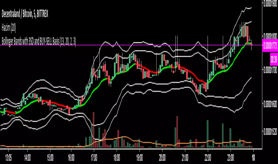
Bollinger Bands with 3SD and BUY-SELL Basis*The white lines(both inner and outer ones) are from original Bollinger Bands (calculated as SMA20+SD and SMA20-SD).
*Inner lines are calculated with 2 Standard Deviation ( as classical Bollinger Bands ) and outer ones are with 3 Standard Deviation.
*3 SD calculation is important because, it is useful to investigate further the volatility.
*Classical Bollinger Bands Basis is included in calculations to obtain the bands, but the basis isn't plotted (SMA20).
*For Basis, a-13 bar EMA line is added which tells "BUY" when GREEN, and which tells "SELL" when RED.
*Generally, this code is good to further investigate the volatility especially by the help of 3SD lines. It is particularly important for crypto currencies which are generally highly volatile. On the other hand, the basis will tell BUY-SELL points and BUY-SELL points can be confirmed further, by investigating classical Bollinger Bands rules and anticipate about the volatility.
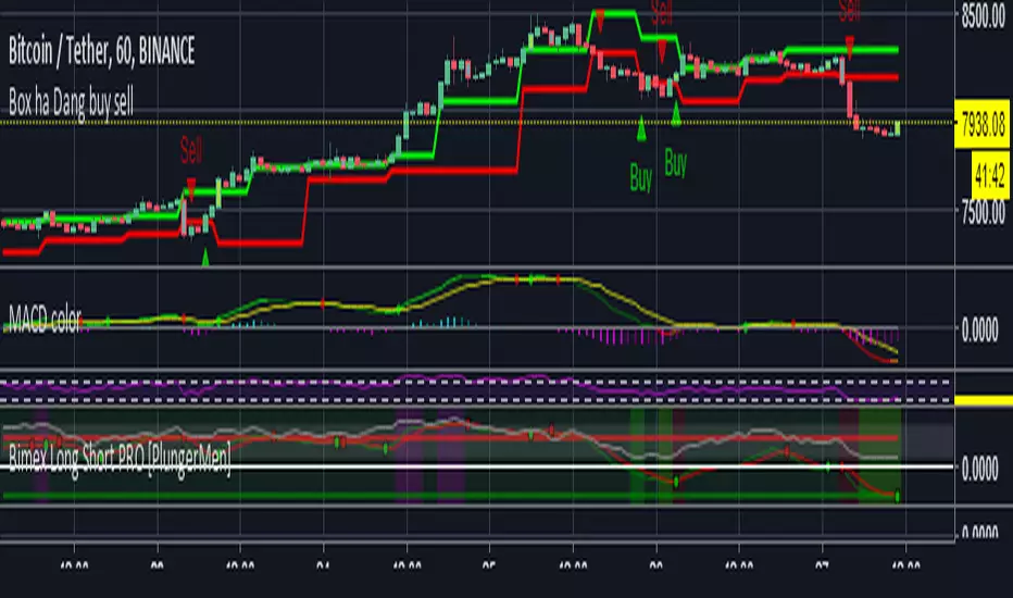
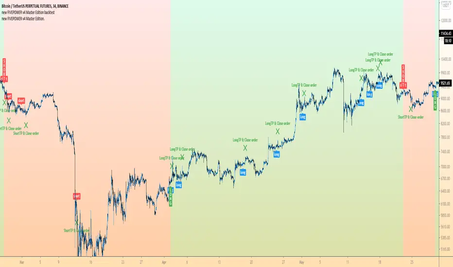
FIVE POWER - BUY SELL by coinssporFOUR POWER - BUY SELL by coinsspor
Four Power include four diffrent indicator.
Heikin Ashi Smoothed
Marvelous Method
RSI BUY-SELL V3
Tillson T3
U can use all of them same time (it gives one common signal) or u can use only one indicator
for example: if u wanna use only one indicator u must select buy level power as 1 and u must select sell level power as 1 after that u need click on only one indicator
if u seleck higher 1 than indicator u need select buy level power higher
and i advice always to use buy power level > sell power level
Prometheus Crypto Scalp/Swing Alerts 1.0Prometheus Crypto Scalp/Swing Alerts was built for scalp/swing crypto traders but you probably got that figured out by yourself. It offers high quality entries and exits which can be manually adjusted to suit your trading style. It performs great on any timeframe but scalp traders will love it for it’s ability to offer many entry points followed by quick exits, giving you opportunity to earn a few % within a few hours.
It has built in BUY/SELL alerts that can be connected to Autoview for automated trading.
How it works?
No drama, no complicated numbers - you only need to set the Alert strength indicator value (5-50) and according to that you will get the kind of alerts you like most. Choosing higher quality alerts will result in smaller quantity of those while picking out just the best entry and exit points and removing less interesting ones. You can always experiment and see what suits your trading style best.
Did we get your attention? If you wish to buy our script, shoot us a PM.
CryptoVN - Automated Trading System with Buy/Sell signalsTrading System:
Heiken Ashi candle
CCI
Double MA for HA Smoothed
An improved version for
Here's an backtest:
Who's paid and joined to beta testing for that version will be free update to this version.
If you like and want to try this, tips and donations are always welcome. :)
Bitcoin: 3BMEXfdqNNmVmtHYvZ1HqMyXchAGLUrbqF
(*) My Advice to You:
- The Trend Is Your Friend. TRADE WHAT YOU SEE, NOT WHAT YOU THINK.
Happy Trading Life ^^!

Crypto Buy/Sell Signals[alt] Autoview/Gunbot -CryptoProToolsA second version of Buy/Sell signals with the basis being EMAGain with an EMA channel filter.
I'm having success using this one to ladder in and out of the market.

CryptoVN - Woodies CCI with Buy/Sell signalsWoodies CCI is a momentum indicator that was developed by Ken Woods.
It's based on a 14 period Commodity Channel Index (CCI) and 06 period CCI called name Turbo CCI (TCCI). It's used to double CCI.
Woodies 14 CCI and 6 turbo CCI with colored histograms that show the trend.
This indicator with the rule for Buy/Sell signals on it.
If you like and use this, tips and donations are always welcome. :)
Bitcoin: 3BMEXfdqNNmVmtHYvZ1HqMyXchAGLUrbqF

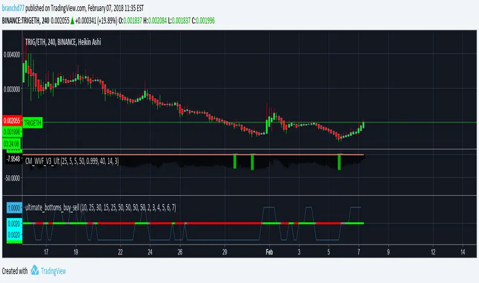
BTC Buy Sell Guide (BSG) - MA & RSIhi BTChes,
green is when the price drops below the 100 day MA
red is the intensity of the 14 day RSI
BUY @ green
SELL @ the second or third RSI spike
most importantly, keep in mind fundamentals :)
-joie

Patrick's Buy/Sell HistogramSimply look for a 12 point long bar and that's a perfect time to buy the security

Buy/Sell Pressure!!!!! DISCLAIMER !!!!!
No indicator can tell the future.
This indicator doesn't tell you when to buy or sell.
Don't use this indicator alone without any other indicator.
It doesn't tell short or long squeeze.
It's just an extra tool can be added to your existing strategy.
If the source/data vendor doesn't provide volume, it will compile a runtime error: "No volume is provided by the data vendor.".
//Indicator Basis
This indicator is based on Average Directional Index (ADX) and transaction quantity (Volume).
From ADX, it's using a modified Directional Index Plus and Directional Index Minus.
From Volume, it's assume based on candle how many buyers or sellers in that volume.
---------------------------------------------------------------------------------------------------------------------------------
I'm not planning to publish the source-code but wanted to gave a basis on which existing indicators I used.
---------------------------------------------------------------------------------------------------------------------------------
//Indicator Description
The indicator show the conditions when the price change is not align with the volume. The buyers want the price go up and the sellers want the price go down.
When the price change is moved to the upside but in the volume show there are more sellers than buyers.
When the price change is moved to the downside but in the volume show there are more buyers than sellers.
It doesn't tells you when we are in short or long squeeze conditions!
It only tell you there are more buyers/sellers dispite the price change to the upside/downside.
When we are either condition, the price can go up or down. It's just helps to find who want take control, the bears (sellers) or bulls (buyers).
As long as the source/data vendor provides volume, it's usable in every time frame.
//Settings
Defualt settings:
Opted in - Red circles above the bar - more sellers dispite the price changed to the upside
Opted in - Green circles below the bar - more buyers dispite the price changed to the downside
Opted out - Orange background in the chart with 50% transparency - more sellers dispite the price changed to the upside
Opted out - Olivie background in the chart with 50% transparency - more buyers dispite the price changed to the downside
Colors, shapes can be customized as you like it.
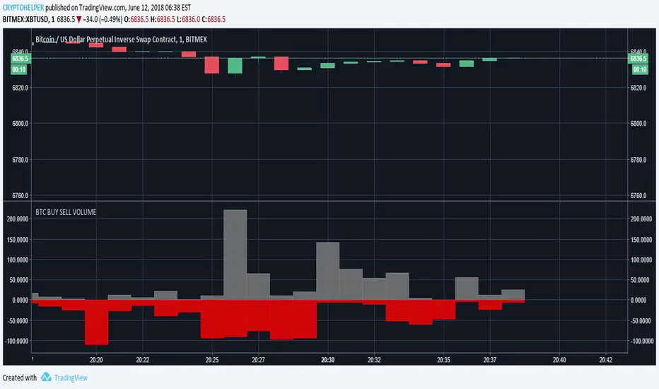
Investonomer - BS VolumeBuy Sell Volume Indicator is a free indicator which can be used with any instrument (stock, index or CFD) where volume information is available on TradingView.This indicator shows us a volume based view of the market activity and it helps us distiguish whether buyer are aggressive or sellers are. Basically, this indicator plots first plots the buyer volume in green. Then the seller volume is printed in red.
If Sellers are more, you will red only, whereas if buyers are more, you will selling volumes and then extra green over it which shows how many buyers are there in the market.

Buy / Sell indicator light version [Crypto_BCT]The indicator is based on the search for the lowest bars in a given period (can be customized).
You can add a search for the highest bars to determine the closed order points.
You can add a filter by the value of the RSI (you can customized it separately for buying and selling).
Alerts for buying and selling are set.
It can be used to work with bots, for example 3COMMAS DCA bot.
--------------------------
Signal Condition Settings:
(Buy) Lowest Bar
The closing of the current bar is lower than the closing of the bars back in this range
(Buy) RSI value <
The RSI index is below this value
(Sell) Highest Bar
The closing of the current bar is higher than the closing of bars in this range
(Sell) RSI value >
The RSI index is higher than this value

Buy/Sell IndicatorBased on logic from many top contributors here, the script utilizes LazyBear's WaveTrend Oscillator Indicator along with custom code to plot a few key components for daily trading;
Boundaries for entry and exit points which are based on a 6-day trend in OPEN/HIGH and OPEN/LOW prices.
Daily HIGH and LOW points to establish a good view of stock's movements
Entry and exit points with confidence levels. These can be treated as entry points for short to medium term investments
Entry points come in the colours of White and Lime, where white is slightly confident and lime is extremely confident
Exit points come in the colours of Maroon, and Red, where maroon is slightly confident and red is extremely confident
Each Entry and Exit point also comes without text, or with a M or H above it, where M indicates medium confidence on the point and an O indicates overconfidence.
Use Case:
The best possible use case is to enter a trade on a LIME point with O text, this means that is an overconfident entry point.
The trade should be exited on a RED point with O text, this means that is an overconfident exit point.
But you can do with the indicators as you please.
In addition to LazyBear's code, the following existing models and indicators are taken into account:
RSI of closing price over a period of 25
EMA of RSI

Buy + Sell [CryptoJewish]Beta
This indicator helps identify areas of buying and selling.
There are 4 levels of signals.
1. Weak
2. Medium
3. Strong
4. Extremely strong
Also there is a lagging indicator, which gives a signal of the 2nd level.
Levels greater than 1 are highlighted with a background and the color of the last bar is mixed with the color of the signal.
Almost everything can be turned on / off.
---
Additionally included:
- Ichimoku Cloud with settings for crypto (pure cloud, no extra lines)
- Bollinger Bands
- 4x SMA with a cross between them
Patrones de entrada/salida V.1.0 -BETA-Este algoritmo intenta identificar patrones o fractales dentro de los movimientos de precios para dar señales de compra o venta de activos.

Magic Circles V3Magic Circles indicator uses an ATR based trend indicator in conjunction with a Parabolic SAR indicator for creating signals. Blue is neutral. Green is buy and red is sell. A hollow green circle followed by a regular green indicates a strong buy while a hollow red circle followed by a regular red one indicates a strong sell signal. This version gives you the option to choose your own magic number. Default is 1.618 also known as the golden ratio. The indicator works best at trending markets.
Version 3 comes with ADX filtering to avoid misleading signals and set on by default. Also you can now see the support / resistance levels. Another option added is showing the current trend direction.
ADX is Average Directional Index and founded by Welles Wilder. Wilder published his work in his book titled New Concepts in Technical Trading Systems (1978).

Magic Circles V2Thanks for your feedback in regard to the Magic Circles indicator. As a common question, Magic Circles indicator uses an ATR based trend indicator in conjunction with a Parabolic SAR indicator for creating signals. Blue is neutral. Green is buy and red is sell. A hollow green circle followed by a regular green indicates a strong buy while a hollow red circle followed by a regular red one indicates a strong sell signal. This version gives you the option to choose your own magic number. Default is 1.618 also known as the golden ratio. The indicator works best at trending markets.
